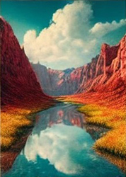
 Photography Tips for Everyday Moments
The most extraordinary beauty is often found in ordinary moments. In this series, William Stanek helps you see the world through a new lens, transforming everyday experiences into stunning photographic memories.
Transform your life with practical wisdom. Discover William Stanek's 'Living Well' series—your guide to a balanced and fulfilling life.
Discover William Stanek's Exclusive Art Collection
Explore and purchase the stunning art featured on this site. Own a piece of William Stanek's unique and captivating artwork today!
(June 7, 2025) Color Theory in Photography: Harmonizing and Contrasting Hues
Color is one of the most powerful elements in photography, capable of evoking emotions, setting the mood, and guiding the viewer's eye through the frame. Understanding and applying the principles of color theory can elevate your photography, helping you create images that are visually striking and emotionally resonant. By mastering color harmonies, contrasts, and tonal unity, you can transform your photos into works of art that captivate and inspire. Here, we’ll delve into the essentials of color theory, focusing on how to harmonize and contrast hues to enhance your photographic compositions.
Introduction: The Power of Color in Photography
Color is a universal language in photography, speaking directly to our emotions and senses. It can soothe or excite, calm or energize, and it plays a crucial role in how we perceive and interpret an image. While some aspects of color are intuitive, a deeper understanding of color theory allows you to use color more intentionally, crafting images that are not only beautiful but also meaningful.
Whether you’re shooting vibrant landscapes, moody portraits, or minimalist still lifes, the way you handle color can make or break your composition. By learning to harmonize and contrast colors effectively, you can create images that are balanced, dynamic, and visually compelling.
In this article, we’ll explore the principles of color theory in photography, focusing on how to use color harmonies, contrasts, and tonal unity to create powerful and cohesive images.
Color Harmonies: Using Complementary and Analogous Colors Effectively
Color harmony refers to the pleasing arrangement of colors within a composition. Harmonious color combinations are visually appealing and create a sense of balance and order. Two of the most common types of color harmonies are complementary and analogous colors, each offering unique ways to enhance your photography.
Complementary Colors: Complementary colors are pairs of colors that are opposite each other on the color wheel, such as red and green, blue and orange, or yellow and purple. When used together, complementary colors create a strong contrast that can make an image pop. This contrast draws the viewer’s attention and creates a sense of vibrancy and energy within the composition.
In photography, you can use complementary colors to highlight your subject or to create a focal point in the image. For example, a red flower against a green background, or an orange sunset reflected in a blue sea, utilizes the natural tension between complementary colors to create a striking visual effect. The key is to balance these colors carefully, ensuring that one doesn’t overpower the other, and that the overall composition remains harmonious.
Analogous Colors: Analogous colors are groups of three colors that sit next to each other on the color wheel, such as blue, blue-green, and green, or red, red-orange, and orange. These colors share a common hue and naturally blend well together, creating a more subtle and cohesive look. Analogous color schemes are often used to create a sense of harmony and unity in an image, making them ideal for more serene, calm, or cohesive compositions.
In photography, analogous colors can be used to create a smooth, gradient-like effect where the colors flow seamlessly into one another. This is particularly effective in nature photography, where the soft transition of colors can enhance the mood and atmosphere of the scene. For instance, a landscape bathed in shades of blue and green can evoke a sense of peace and tranquility, while a warm palette of red, orange, and yellow can create a feeling of warmth and vitality.
Pro Tip: When working with complementary or analogous colors, consider the dominant color in the composition and how the other colors will support or contrast with it. Adjust the saturation and brightness of the colors to achieve the desired effect, and be mindful of how different lighting conditions can affect the appearance of these colors.
Exercise: Create a series of images using both complementary and analogous color schemes. Start by choosing a dominant color, and then either find its complement or select analogous colors to build your composition. Experiment with different subjects and lighting conditions to see how the colors interact and affect the overall mood of the image. Reflect on how using these color harmonies enhances the visual appeal of your photos.
Color Contrast: Making Your Subject Stand Out Through Color Contrast
Color contrast is one of the most effective ways to make your subject stand out in an image. By using contrasting colors, you can draw the viewer’s eye to specific areas of the frame, creating a clear focal point and adding depth and dimension to the composition.
Understanding Color Contrast: Color contrast is created when two colors that are significantly different from each other are placed next to one another. High contrast between colors makes the subject more prominent and attention-grabbing, while low contrast creates a more subtle, blended effect. The level of contrast you choose depends on the mood and message you want to convey in your image.
For instance, placing a bright yellow subject against a dark blue background creates a high-contrast image that immediately draws the viewer’s attention to the subject. On the other hand, a low-contrast image might feature shades of the same color, with the subject subtly blending into the background, creating a more nuanced and understated composition.
Using Warm and Cool Colors: One of the simplest ways to create color contrast is by playing with warm and cool colors. Warm colors (reds, oranges, and yellows) tend to advance in a composition, making them ideal for drawing attention to the subject, while cool colors (blues, greens, and purples) tend to recede, creating a natural backdrop. By contrasting warm and cool colors, you can create a sense of depth and separation between the subject and the background, making the image more dynamic.
Creating Contrast Through Saturation: Another way to create color contrast is by varying the saturation of colors within the image. A highly saturated subject against a desaturated or muted background will naturally stand out, even if the colors are similar in hue. This technique can be used to create a focal point without relying on complementary or highly contrasting colors, adding subtlety and sophistication to your composition.
Pro Tip: When using color contrast, consider how it affects the overall balance and harmony of the image. While contrast can make your subject stand out, too much contrast can create a jarring or unbalanced composition. Aim for a contrast level that enhances the image without overwhelming it.
Exercise: Experiment with color contrast by photographing subjects against contrasting backgrounds. Use both warm and cool colors, as well as varying levels of saturation, to see how these choices affect the prominence of your subject and the overall impact of the image. Reflect on how color contrast helps you direct the viewer’s attention and create a more dynamic composition.
Tonal Unity: Creating a Cohesive Look by Balancing Colors Across an Image
Tonal unity refers to the overall harmony and balance of colors within an image. By carefully controlling the tones and hues, you can create a cohesive look that ties the composition together, making the image feel more intentional and polished.
Achieving Tonal Unity: Tonal unity is achieved when the colors in an image complement each other, creating a sense of coherence and balance. This can be done by limiting the color palette to a few harmonious hues, or by adjusting the tones so that they share a similar level of brightness and saturation. For example, a monochromatic color scheme, where all the colors are shades of the same hue, naturally creates tonal unity. Alternatively, you can achieve tonal unity by using colors that share a common undertone, such as cool blues and greens or warm reds and oranges.
Balancing Colors Across the Frame: To create a cohesive image, consider how the colors are distributed across the frame. Colors that are evenly balanced and well-distributed create a sense of order and harmony, while uneven or random color placement can disrupt the flow of the image. When composing your shot, pay attention to the balance of colors and how they interact with each other. For example, if you have a strong, dominant color in one part of the image, consider balancing it with a similar color or tone elsewhere in the frame.
Using Post-Processing to Enhance Tonal Unity: Post-processing offers additional tools for achieving tonal unity. Adjusting the white balance, saturation, and color grading can help to unify the colors in an image, creating a more cohesive look. For instance, applying a subtle color grade across the entire image can tie the colors together, making them feel more connected and harmonious. Be mindful not to overdo it—tonal unity should enhance the image, not flatten or diminish its visual interest.
Pro Tip: When editing for tonal unity, consider the mood and atmosphere you want to convey. Warmer tones can create a sense of warmth and intimacy, while cooler tones can evoke calmness or detachment. Use color grading and tonal adjustments to reinforce the emotional tone of the image.
Exercise: Take a series of photos with the goal of achieving tonal unity. Focus on balancing the colors within the frame, either by limiting the color palette or by adjusting the tones in post-processing. Experiment with different approaches, such as monochromatic schemes or subtle color grading, and reflect on how tonal unity contributes to the overall harmony and cohesiveness of your images.
Mastering Color Theory: A Key to Creating Striking Visuals
Understanding and applying color theory in photography is a powerful way to enhance your images, making them more visually appealing and emotionally impactful. By mastering the principles of color harmony, contrast, and tonal unity, you can create compositions that not only capture the eye but also convey a deeper sense of meaning and emotion.
Color as a Tool for Storytelling: In photography, color is more than just an aesthetic choice—it’s a tool for storytelling. The colors you choose can set the mood, guide the viewer’s eye, and reinforce the narrative you want to convey. Whether you’re capturing the vibrant energy of a cityscape, the serene beauty of a landscape, or the intimate emotions of a portrait, the way you use color can make all the difference.
Pro Tip: Always consider the emotional impact of color in your images. Think about how different colors make you feel and how they influence the mood of the photograph. Use this understanding to make intentional color choices that support the story you’re telling.
Exercise: Review a selection of your recent photos and analyze how you’ve used color in each one. Consider how the colors contribute to the mood, balance, and impact of the image. Reflect on what worked well and where there might be opportunities to apply the principles of color theory more effectively. Use this insight to guide your future photography projects.
Conclusion: The Art and Science of Color in Photography
Color is a fundamental aspect of photography, influencing how we perceive and connect with images. By mastering color theory, you can take control of this powerful element, using color to harmonize, contrast, and unify your compositions in ways that enhance both the visual and emotional impact of your work.
As you continue to explore the world of color in photography, remember that color is not just a technical consideration—it’s an essential part of your creative expression. Use it wisely, experiment boldly, and let color become a key part of the stories you tell through your lens.
Share your color-rich photography with us on Instagram using #ColorTheoryInFocus. We’re excited to see how you’re using color to create striking and meaningful images.

Join William at the crossroads of technology, business, and leadership, where true influence isn't about titles - it's about inspiring action, driving change, and guiding others with integrity. Discover how authentic leadership can transform not just careers, but entire industries.
Bring Inspiration Home
Enhance your space with William Stanek's evocative art. Each piece is crafted to inspire and uplift your everyday life.
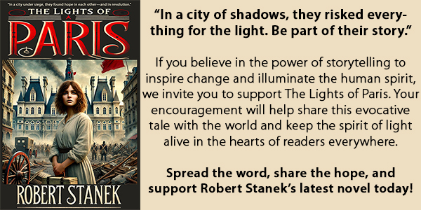
Support The Lights of Paris by Robert Stanek, William Stanek's pen name! Through vivid historical detail and deeply moving character stories, Robert takes readers on an unforgettable journey through one of history’s most transformative times.

