 Photography Tips for Everyday Moments
In a world filled with extraordinary beauty, sometimes it's the ordinary moments that hold the most magic. In the "Photography Tips for Everyday Moments" series, William Stanek invites you to see the world through a new lens, where the everyday becomes art. Whether you're a seasoned photographer or just beginning your journey, these articles are designed to help you capture the subtle beauty that often goes unnoticed.
Transform your life with practical wisdom. Discover William Stanek's 'Living Well' series—your guide to a balanced and fulfilling life.
Discover William Stanek's Exclusive Art Collection
Explore and purchase the stunning art featured on this site. Own a piece of William Stanek's unique and captivating artwork today!
(February 18, 2025) Creative Color Techniques: Using Color to Evoke Emotion
Color is one of the most powerful tools in a photographer’s arsenal. It has the ability to evoke emotions, set the mood, and guide the viewer’s eye through an image. By understanding the psychological effects of different colors and mastering techniques to manipulate and harmonize them, you can take your photography to new heights, creating images that not only capture the moment but also resonate on a deeper emotional level. Here, we’ll explore how to use color creatively in your photography, focusing on color psychology, the art of the color pop, and techniques for harmonizing tones in your compositions.
Introduction: The Emotional Impact of Color in Photography
Color is everywhere, and it’s one of the first things that grabs our attention when we look at a photograph. But color does more than just attract the eye—it also influences how we feel about an image. Different colors can evoke different emotions, from the warmth and comfort of reds and yellows to the calm and serenity of blues and greens. As a photographer, learning how to use color intentionally allows you to enhance the mood and emotional impact of your images.
Whether you’re photographing a vibrant street scene, a serene landscape, or a simple portrait, the colors in your image play a crucial role in telling the story. By understanding the psychology of color and mastering creative techniques, you can create photos that not only look beautiful but also evoke the feelings you want to convey.
In this article, we’ll dive into the power of color in photography, exploring how to use it to evoke emotion, draw attention to your subject, and create harmonious compositions.
Color Psychology: Understanding How Different Colors Affect Mood and Perception
Color psychology is the study of how colors affect our emotions and perceptions. In photography, understanding the psychological impact of different colors allows you to use them more effectively to convey the mood or message you want your image to express.
Warm Colors: Red, Orange, Yellow: Warm colors are associated with energy, warmth, and passion. They can evoke strong emotions, ranging from excitement and enthusiasm to anger and urgency. Red, for example, is often used to draw attention and create a sense of intensity or passion. Orange conveys warmth and happiness, while yellow is associated with optimism and cheerfulness. These colors are powerful tools for creating a dynamic, energetic mood in your photos.
Cool Colors: Blue, Green, Purple: Cool colors are calming and soothing, often evoking feelings of tranquility, relaxation, and introspection. Blue, for instance, is commonly associated with calmness, serenity, and trust, making it ideal for images that convey peace or stability. Green represents nature, renewal, and balance, while purple can evoke a sense of mystery, luxury, or creativity. These colors are perfect for creating a serene, contemplative atmosphere in your images.
Neutral Colors: Black, White, Gray, Brown: Neutral colors can act as a backdrop or a counterbalance to more vibrant hues. Black and white are often associated with simplicity, elegance, and timelessness, making them effective for classic or minimalist compositions. Gray can convey neutrality, sophistication, or a sense of detachment, while brown evokes earthiness, warmth, and reliability. Neutrals can either complement other colors or stand alone to create a strong, understated mood.
Contrasting Colors: Contrasting colors, such as complementary colors (those opposite each other on the color wheel), can create visual tension and draw the viewer’s eye to specific parts of the image. For example, the contrast between blue and orange, or red and green, can make elements of a photo pop, adding energy and dynamism to the composition.
Pro Tip: When composing your shots, consider how the colors in the scene will affect the viewer’s mood and perception. Use warm colors to add energy and excitement, cool colors to create a calm and peaceful atmosphere, and neutrals to balance or emphasize other colors.
Exercise: Spend a day photographing with color psychology in mind. Choose scenes or subjects that naturally feature warm, cool, or neutral colors, and experiment with how these colors influence the mood of your images. Reflect on how different color palettes change the emotional impact of your photos.
Color Pop: Using Selective Color to Draw Attention to Your Subject
Selective color is a creative technique that involves highlighting a single color in an otherwise black-and-white or muted image. This technique draws immediate attention to the colored element, making it stand out as the focal point of the composition. The color pop effect can be used to create striking, dramatic images that emphasize a particular subject or detail.
Highlighting a Single Element: The most common use of selective color is to isolate one element of the image and render everything else in black and white. For example, you might photograph a red umbrella in a rainy street scene, with the umbrella remaining in color while the rest of the scene is desaturated. This technique draws the viewer’s eye directly to the umbrella, making it the focal point of the image.
Enhancing a Mood or Theme: Selective color can also be used to enhance the mood or theme of an image. For instance, you could highlight the blue of the sky in an otherwise monochromatic landscape to emphasize the serenity of the scene. Or, you could bring out the green of a plant in an industrial setting to symbolize life and growth amidst decay.
Subtle Color Pops: While bold color pops are often the most dramatic, subtle uses of selective color can also be effective. For example, you might retain just a hint of color in a black-and-white portrait, such as the natural blush of the subject’s cheeks or the blue of their eyes. This approach adds a touch of realism and depth while maintaining the overall monochromatic feel.
Creating the Effect in Post-Processing: Selective color effects are typically achieved in post-processing. Most photo editing software allows you to desaturate specific areas of an image while retaining color in others. This process involves masking the area you want to keep in color and then desaturating the rest of the image. The key is to be precise with your masking to ensure a clean, professional look.
Pro Tip: Use selective color sparingly. While it can be a powerful tool for drawing attention to a subject, overuse of the technique can make your images feel gimmicky. Reserve it for situations where the color pop adds meaningful emphasis to the composition.
Exercise: Practice the selective color technique by choosing a subject that features a bold, distinctive color. Capture the scene and then use post-processing to isolate that color while desaturating the rest of the image. Experiment with both bold and subtle color pops, and reflect on how this technique changes the focus and impact of your photo.
Harmonizing Tones: Techniques for Balancing Colors Within a Composition
Harmonizing tones involves creating a balanced, cohesive color palette within your composition. When colors are harmonized, they work together to create a pleasing visual effect, enhancing the overall mood and aesthetic of the image. There are several techniques you can use to achieve color harmony in your photography.
Analogous Colors: Analogous colors are those that sit next to each other on the color wheel, such as blue and green, or red and orange. These colors naturally harmonize because they share a common hue, creating a sense of unity and cohesion in the image. Using analogous colors in your composition can create a calm, serene atmosphere, as the colors blend smoothly together.
Complementary Colors: Complementary colors are opposite each other on the color wheel, such as blue and orange, or yellow and purple. When used together, these colors create a vibrant, high-contrast effect that can make certain elements of the image stand out. The key to using complementary colors effectively is to balance them so that one color doesn’t overpower the other, creating a dynamic but harmonious composition.
Triadic Colors: Triadic color schemes involve three colors that are evenly spaced around the color wheel, such as red, blue, and yellow. This color scheme offers a vibrant yet balanced palette, with each color complementing the others. Triadic color schemes can be particularly effective in creating lively, energetic compositions, but they require careful balancing to avoid overwhelming the viewer.
Monochromatic Color Schemes: A monochromatic color scheme uses different shades, tints, and tones of a single color. This approach creates a very cohesive and unified look, with the subtle variations in the color adding depth and interest. Monochromatic schemes are often used to create a minimalist or elegant aesthetic, as the lack of contrasting colors allows the subject and composition to take center stage.
Using Natural Color Harmonies: Nature often provides its own color harmonies, particularly at sunrise and sunset, when the sky is filled with a gradient of analogous colors. When photographing natural scenes, pay attention to how the colors interact with each other, and use these natural harmonies to enhance your composition.
Pro Tip: When editing your photos, use tools like color balance and color grading to fine-tune the harmony of your image. Small adjustments to the hue, saturation, and luminance of individual colors can make a big difference in how the colors work together.
Exercise: Create a series of images that explore different color harmonies. Start with an analogous color scheme, then move on to complementary, triadic, and monochromatic schemes. Pay attention to how the different color relationships affect the mood and balance of your images. Reflect on which schemes resonate most with your style and how you can incorporate them into your photography.
Expressing Emotion Through Color: The Power of a Thoughtful Palette
Color is a language in itself—one that speaks directly to our emotions. By understanding and harnessing the power of color in your photography, you can create images that do more than just capture a scene—they evoke feelings, tell stories, and connect with viewers on a deeper level.
Crafting Your Color Signature: As you continue to develop your photography style, consider how color can become a part of your signature. Whether you’re drawn to the bold, vibrant hues of urban life or the soft, muted tones of natural landscapes, the way you use color can be a defining feature of your work. Think about how you can use color to express your personal vision and create a consistent, recognizable palette across your portfolio.
Pro Tip: Pay attention to how color is used in other art forms, such as painting, film, or graphic design. Understanding how different artists and mediums use color to convey emotion and tell stories can inspire new approaches in your photography.
Exercise: Review your portfolio and identify the color palettes that recur in your work. Consider how these palettes contribute to the mood and style of your images. Set a goal to experiment with different color techniques—such as selective color, harmonizing tones, or color psychology—in your next photo shoot, and see how these techniques enhance your ability to evoke emotion through color.
Conclusion: The Emotional Palette of Photography
Color is one of the most versatile and expressive tools in photography. It has the power to evoke emotions, guide the viewer’s eye, and create a cohesive narrative within your images. By mastering creative color techniques, you can transform everyday scenes into powerful visual stories that resonate with your audience.
As you continue to explore the world of color in your photography, remember that the choices you make—whether it’s the boldness of a color pop, the subtlety of a monochromatic scheme, or the balance of a complementary palette—are all part of your artistic voice. Use color thoughtfully and intentionally to create images that are not only visually striking but also emotionally compelling.
Share your color-driven photos with us on Instagram using #ColorInFocus. We’re excited to see how you’re using color to evoke emotion and tell stories through your photography.
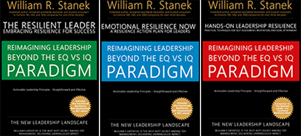
Join William at the crossroads of technology, business, and leadership, where true influence isn't about titles - it's about inspiring action, driving change, and guiding others with integrity. Discover how authentic leadership can transform not just careers, but entire industries.
Bring Inspiration Home
Enhance your space with William Stanek's evocative art. Each piece is crafted to inspire and uplift your everyday life.
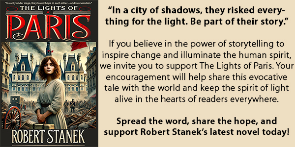
Support The Lights of Paris by Robert Stanek, William Stanek's pen name! Through vivid historical detail and deeply moving character stories, Robert takes readers on an unforgettable journey through one of history’s most transformative times.
